Intro
Crickx research group
Before the 2000s, the Schaærbeek shop windows were adorned with vernacular letterings reflecting the different cultures living together in this municipality, painted or cut and pasted by various professionals. Among these signs, there was a recurring set of letterforms that was certainly not machine-cut. Walking down Avenue Rogier, passers-by could easily spot Publi Fluor, a shop where Chrystel Crickx would cut them by hand. You couldn't miss it, as the shop was the epicenter of a typographic wave that radially produced shop windows during nearly forty years.
When Chrystel Crickx closed down her business in 2001, graphic and type designer Pierre Huyghebaert bought her entire stock of self-adhesive letters in order to save them from destruction. Twenty years later, the Crickx research group was formed around this archive, now kept by Spec uloos (Sophie Boiron and Pierre). In parallel, a research and creation lab was launched by the École Supérieure des Arts de l'image Le 75 by an interdisci-plinary team composed of teachers and students. A riveting object of study, the archive aroused curiosity for the eminently contemporary issues it raises: the economy of means (low-tech production and alternative means of distribution), local practices (craftspersonship, self-education, and vernacular, professional amateurism), proximity and distance with the machine, property and m·paternity.
In the present volume, the Crickx research group has documented the archive and its various appropriations in order to publicize its cultural and political stakes. The research on the Publi Fluor archive is organized around points:
1: the history of Christel Crickx's business, her (work)shop and her economy;
2: the design and the aesthetics of her vinyl letters. The shift from materiality of digital fonts and their licenses. The contemporary uses of Crickx. The family ties between every version of these letters;
3: their traces in the city, transmission, variations.
Most of the methods and techniques used to understand these letters and their ecology are unorthodox: unpacking the archive, partial classification, first-person narrative, investigation, interviews, mapmaking, appropriation, window lettering. The desire to play with these letters mirrors their characteristics. They are brightly colored (even fluorescent), modest (in relation with their creator's concern for discretion), produced in large quantities (to meet the demand), economical (the object of a viable business), vernacular (their traces all over Brussels), eccentric (proposing an original model of slanted, half-square, half-rounded letters), both transitory and sustainable (vinyl being paradoxically as erosive as it is resistant), old-fashioned yet vibrant (Publi Fluor is now closed down, but the digitization of these letters has offered them an alternative mode of perpetuation) and popular (drawn to be read by a large public, and supported by the enthusiastic promotion of many members of the typographic community, further encouraging the publication of this book).
Chrystel Crickx's letterforms seem to ignore typographic conventions. Indeed, Chrystel had absolutely no training in the field. The eldest of three sisters, she inherited her father's model — an ingenious letterer — when she decided to take over his business upon his death. Unlike him, who cut letters before applying them himself on his customers' windows, Chrystel Crickx worked on her own and didn't want to step out of her shop. She preferred selling her letters from inside, progressively modifying her father's model in order to facilitate the application of the letters for the non-specialists unaware of the joys of typographic composition. Today, the research group and an entire community of users call this method, which allowed Chrystel to produce letters for the open air while staying inside her shop, the "Crickx" model. Cutting letters in her kitchen behind the counter, she developed a lettering practice that was less mobile, yet more commercial.
However, to what kinds of fields do these letters belong? Shop signs? Lettering? Graphic design? Ornament? Utility? They actually seem to inhabit the limits of all these categories. As a self-taught type designer, Chrystel Crickx empirically devised inventive design solutions that served her typographic and commercial practice. The Publi Fluor archive is not only a letter repository, but also a registry of everyday life, of the sources and of the economy of her unique practice. After being hand-cut for local advertising uses, these letters have been digitized and made more broadly accessible to users from all over the world, working in other contexts. Inhabiting the margins of normalized means of communication, they have contributed and still contribute to the visual urban environment, in Brussels and elsewhere.
This non-standard, collective attempt, made by the Crickx research group and external contributors (practitioners, designers, active artists and theorists) has tried to draw a portrait of a woman and her objects -- tools, letters, furniture and boxes -- while expanding the field of investigation to examine the 'crackx' between the various histories summoned by this practice. All of the keys necessary for your exploration are supplied in the next chapter. Welcome to the Publi Fluor ecosystem.
Ecosystem
Crickx research group
Key dates
- 1910
- 1916
- 1939
- 1943
- 1944
- 1953
- 1957
- 1958
- 1961
- 1961
- 1968
- 1969
- 1970
- 1972
- 1973
- 1974
- 1980
- 1984
- 1985
- 1989
- 1991
- 1994
- 1996
- 1997
- 1998
- 1999
- 2000
- 2001
- 2003
- 2004
- 2006
- 2007
- 2010
- 2011
- 2013
- 2014
- 2016
- 2017
- 2019
- 2020
- 2021
- 2022
- 2023
- 2024
1910 Birth of Raymond, Chrystel's father, in Tournai. 1916 Birth of Alberte (nicknamed Betty), Chrystel's mother, in Ghent. 1939 Birth of Chrystel's brother. 1943 Birth of Chrystel. 1944 Birth of Marie-Claude, Chrystel's sister. 1953 Raymond's first (work)shop, in a house on rue Vifquin, in Schaærbeek (Brussels), probably at number 10. The letterings he produces are based on hand-cut vinyl, while the vast majority of letterers work directly on their support with paint and brush. 1957 The shop and the family move from Rue Vifquin to Rue des Coteau, at an unidentified number. 1957 Chrystel leaves school at age 14. 1958 Birth of Marcelline, Chrystel's sister. The shop, under the name Fluoréclam, move to 80 Avenue Rogier [Fig. 1].

1961 Chrystel's first marriage, at age 18. She lives in Ostend and works in a grocery store founded by her husband, then as an usher in a movie theater. She then opens a bar/dance club/bowling hall called 't Mandje. 1965 Chrystel, 22, leaves Ostend and her husband. She works at the Bonbons Antoine candy shop in Ixelles. Her artisanal qualities are noticed by the boss, who appoints her at the industrial design department 1968 Chrystel meets the father of her first son. They live on Rue des Coteaux. 1969 Birth of Chrystel's first son, Serge. The couple then break up. She meets and marries René Crickx. 1970 Birth of Michel, Chrystel's second son. Roger Nols is elected burgomaster of Schaærbeek. In this destitute municipality, he espouses a populist, right-wing, anti-Flemish, and racist policy. 1972 Raymond falls ill, and the three sisters work together in his business for a couple of months. 1973 Raymond dies. Chrystel takes over the shop and works with her sisters.

Their father's collages on the facade infuriate the building's owner, and Chrystel moves the business to number 74 of the same street. Her sister Marie-Claude opens a gift shop at number 72. 1974 The Halles de Schaerbeek are converted into a cultural venue, 500 meters away from the shop. 1974 Chrystel buys a house on 102 Avenue Rogier, and reopens the shop under a new name, Publi Fluor. There, she cuts and sells individual letters, but doesn't apply them for her customers. 1980 The first computer-controlled cutting plotters are made commercially available. 1984 Following Xerox, the first graphical user interface computers are made commercially available, with Apple, Microsoft, Adobe, and PostScript. Gradually yet rapidly, independent professionals working with drawing and letter composition adopt this new technology. 1985 Without knowing their origins, Pierre Huyghebaert notices Chrystel's letters on Schaærbeek shop windows, standing out amongst other mostly-painted letterings. 1989 Roger Nols' term as burgomaster ends. Belgium becomes a federated state, and the Brussels-Capital Region is created. 1991 Pierre starts producing experimental fonts with Misch Dimmer and Karl Bassil during their studies at erg (école de recherche graphique, Ixelles), under the moniker Hammerfonts. 1994 After the Nols era, elected representatives of Moroccan and Albanian origins enter the Schaerbeek municipal council. 1996 After several years, the renovation of the Halles de Schaerbeek is complete. Pierre now works in collaboration with artist Vincent Fortemps. Together they design the center's graphic identity, producing booklets and posters.
1997 Working on posters for an Indian film festival,
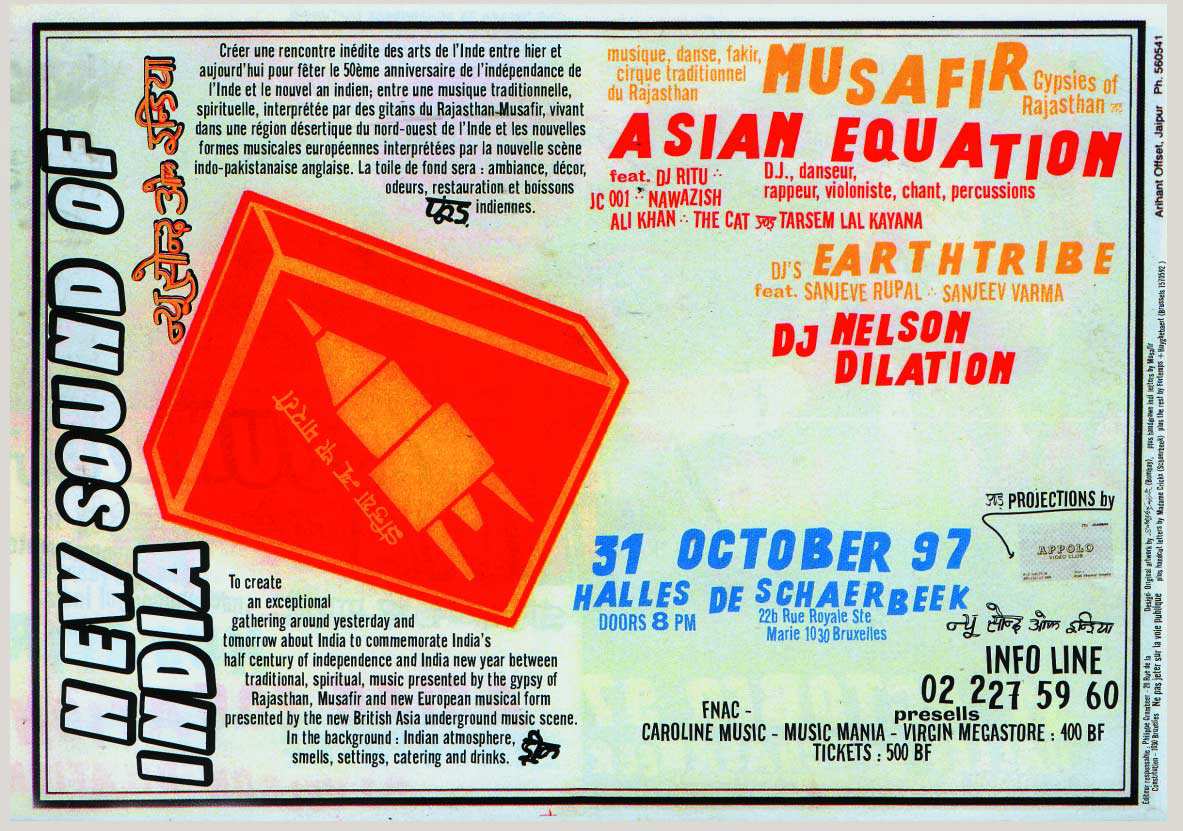
Pierre and Vincent consider using cut-out letters that adorn many windows around the Halles, despite the progressive use of standardized types. Tracing their origin, Pierre finds the Publi Fluor shop and meets Chrystel. He orders a 4 cm high, 26 letters and 10 numbers, "normal style" set (the most widespread italic), which he digitizes and vectorizes with the Streamline software (afterwards integrated to Adobe Illustrator). With these vectorized letters, he quickly sets the poster title. Pierre then creates the first digital font, naming it "Crickx Rush." It is used for other posters, flyers, programs and logos within the Halles de Schaerbeek.
1998 Jan Middendorp, a journalist and editor of Druk type magazine, published by FontShop Belgium, writes an article about Pierre and Vincent's graphic production for the Halles. Pierre uses the font for Fréon. He shares the type with other people in his professional circle for practical reasons, without any clear specification in terms of licensing. 1999 Jan commissions Pierre for a 5-page article about Chrystel for Druk. He writes it in French, designs the layout, and Jan translates it into Dutch. When Druk issues a reader poll about its most popular articles, Pierre's essay is ranked first. Chrystel closes her shop. "I've done that [cutting letters] for 26 years." Between Christmas and the New Year, René Crickx dies. 2000 Chrystel retires and moves to a house in Wallonia. 2001 Speculoos --- the studio of which Pierre is an associate with two others --- buys all the remaining self-adhesive letters, as well as the archives, for a symbolic price in order to prevent them from being destroyed. At the end of the year, Pierre orders lower case letters, punctuation marks and symbols from Chrystel in order to complete the glyph set. She produces the version that would later be called "Blobby" by OSP. 2003 Crickx-rush-light-ext (one of the many optimized versions produced by Speculoos for Flash websites), credited to Hammerfont, is leaked across the Belgian-French contemporary comic-book publishing network and is featured in the Paris-based magazine Bang!.
2004 Crickx letters are displayed in the Speculoos window on Chaussée de Charleroi, in Saint-Gilles. 2006 Harrisson, Femke Snelting, and Nicolas Malevé found Open Source Publishing (OSP). The "caravan" is anchored in Constant's practice. Ludi Loiseau arrives in Brussels through the École nationale des arts visuels de La Cambre and meets Pierre, who has been teaching there for three years. The second Print Party is organized by Harrisson and Femke at La Quarantaine, in Ixelles. Pierre and Ludi are among the attendees. During this event, an entire booklet is produced live, using various free software. Ludi starts working for Speculoos. Pierre joins OSP for a Print Party in Berlin with Harrisson as a substitute for Femke. 2007 Ludi joins OSP during a trip to the Wrocaw Libre Graphics Meeting (Poland), during which the first OSP fonts are designed. They are later published under a SIL Open Font License (OFL). 2010 Interning at Speculoos and OSP, Ludi and Antoine Begon redesign the Crickx fonts and publish them on the OSP foundry as well as on other free type platforms. Crickx starts circulating more widely. 2011 Sophie Boiron joins Speculoos. The Constant Variable hackerspace opens in Schaærbeek, 1 km away from Publi Fluor. Variable hosts art practices inspired by free software, and OSP open their first studio in the premises. The Crickx archive is relocated to the building and is used for its graphic identity. Chrystel visits the place during the official opening party. The archive is made available for the public. 2013 Variable closes. A part of the Crickx archive is exhibited. The event is organized at the neighboring cultural center, De Kriekelaar. The archive is then relocated in OSP's new offices, on the 26th floor of one of the two WTC towers in Brussels. 2014 Femke writes "Today She Started With C". 2016 The magazine Médor (co-founded by Ludi and Pierre) performs an unrecorded show for Live Magazine at the Théatre national, with a short lecture by Pierre about the "Crickx story."
05.04.2017 Festival Papier Carbone, Charleroi: Ludi and OSP member Stéphanie Vilayphiou cut an "autotrace version" of Crickx letters from vinyl sheets, offering them to the public. 2017 On Sophie's initiative, the archive is relocated in Spec uloos' (renamed with spacing inserted between the two parts of the name) new office space, 47 Rue Van Elewyck, Ixelles. 2019 Chrystel's first son dies. 10.2019 The matrices are displayed in Spec uloos' window during We Art XL. 2020 Florist Nouveau opens in Ixelles. They exclusively use Crickx for their communication.
2020 "Un Futur pour la Culture," a call for projects, is launched by the Wallonia-Brussels Federation (a.k.a the Brussels French Community). Surface Utiles editions grab this opportunity to fund a project that could lead to a publication on the Publi Fluor archive. The Crickx research group is founded after receiving the public grant. 12.01.2021 First meeting of the Crickx research group. 10.02.2021 Olivier Bertrand and David Le Simple launch the Laboratoire de recherche-création Crickx at l'ESA Le 75, focused on the Publi Fluor archive, alongside a transdisciplinary team of students. Pierre and Sophie present an opening lecture as guardians of the archive. 09-13.03.2021 The Publi Fluor unpacking workshop is organized at Spec uloos by the students and the research group. Elements from the archive are displayed in the studio's window, which is lettered for the occasion.

31.03.2021 The lab launches a typographic tracking, looking for Crickx characters around Avenue Rogier, in Schaærbeek. 21.04.2021 Artist/archivist Mathieu Gargam meets the lab as a guest. 29.09.2021 Launch of the first report of the Laboratoire de recherche-création Crickx, on Rue Crickx in Saint-Gilles (the name being relatively common in Brussels). A window is lettered for the occasion. 09.2021 An open-call for contributions titled "Cherche amateurix de la Crickx" ["looking for Crickx lovers"] is launched in order to document the various uses of the font. 20-21.10.2021 A Touring Club is organized to search for other traces of the Crickx letters in Brussels. The students of Le 75, David, Ludi, Olivier and Sophie interview several Crickx users. 16.11.2021 Chrystel's first long-form interview is conducted by the research group. 20.04.2022 Restitution and presentation of the students' research and creation projects, in the presence of Mathieu Gargam. 07.05.2022 Closing workshop of the Laboratoire de recherche-création, in the presence of graphic designer Axel Benassis. A 1:1 specimen of Chrystel's letters is composed for an issue of the typographic journal La Perruque. 09.2022 Former Le 75 student and member of the lab, Nathan Izbicki, is invited to join the Crickx research group. 20.11.2022 A second long-form interview of Chrystel as well as her sisters. 01.2023 The Crickx research group receives a grant from the Vlaamse Gemeenschap (Flemish Community) for their publication and typographic research projects. 06.03.2023 During a lecture based on her essay "My Letters" Femke publicly unpacks the issues of authorship and of licensing linked to Crickx during the "Post\$cript, écoles sous licence" symposium held at erg. 04.2023 The Wallonia-Brussels Federation delivers a grant supporting the present publication. 08--12.05.2023 Residency of the research group at Constant's studios, Chausée de Jette in Koekelberg. 25-26.05.2023 The research group supervises "Resharpening Blobby" a workshop organized during the Ultradependent Public School at BAK, Utrecht (The Netherlands). 10.06.2023 Chrystel and the research group visit the former addresses of Fluoréclam et Publi Fluor in Schaerbeek. 11-15.09.2023 Residency of the research group at Meyboom Artist-Run Spaces, Brussels. 04.2024 The book Publi Fluor. Letter Business in Brussels is launched in Schaerbeek, and the digital font is republished as Publi Fluor.
Common names
Brussels
The capital city of Belgium. Part of the Brussels-Capital Region, one of the three regions that make up the country of Belgium, itself composed of nineteen municipalities. In this book are featured Schaerbeek, Anderlecht, Bruxelles- Ville, Forest, Molenbeek-Saint-Jean, Saint-Gilles, Ixelles and Woluwe-Saint-Lambert. In everyday language, "Brussels" is often mistakenly used to refer to the Brussels-Capital Region.
ESA Le 75
Located in Woluwe-Saint-Lambert, the École supérieure des arts de l'image Le 75 offers a Bachelor's Degree with four orientations: graphic design, plural printed images, painting, and photography.
Crickx research group
Publi Fluor is a project led by the Crickx research group, composed of Sophie Boiron (type designer, graphic designer, cartographer, and guardian of the Crickx archive), Pierre Huyghebaert (designer, type designer, cartographer, and guardian of the Publi Fluor archive), Nathan Izbicki (artist, photographer), David Le Simple (bookseller, publisher, and educator), Ludivine Loiseau (type designer, designer, and educator) and Femke Snelting (researcher). Their research has resulted in the publication of this book, as well as in the renaming and extension of the Crickx digital glyph set.
Laboratoire de recherche-création Crickx
A research and creation laboratory formed around the Publi Fluor archive by a transdisciplinary group of students and teachers from ESA Le 75 between late 2020 and May 2022. Members: Soazig Auvray, Camille Balseau, Olivier Bertrand, Pauline Barret, Leyla Cabaux, Abigaël Coeffier, Léonard Gensane, Nathan Izbicki, David Le Simple, Lysiane Schwab, Élise Tanguy.
Fréon
Fréon is a contemporary comic- book publishing house founded by Thierry Van Hasselt, Vincent Fortemps, Olivier Poppe, Olivier Deprez, and Denis Deprez in the early 1990s, after meeting at the comic-book section of Saint-Luc, in Brussels. Their catalogue is small, but rigorous and rich. In 2002, they merged with French publisher Amok, and became FRMK (pronounced "Fremok").
Bye Bye Binary (BBB)
BBB is a French-Belgian collective whose actions nourish the debate on the political dimension of graphic design, language, and of the representation of bodies and identities. BBB lead their research with an activist and communitarian stance, being operated by and working with the concerned population, through a feminist, queer, trans, gay, bi, and lesbian prism. Since 2021, they have published a type library gathering and circulating a collection of post-binary characters intended for the largest audience possible.
Open Source Publishing (OSP)
OSP is a Brussels-based graphic design collective. Their primary material is type design, websites, web-to-print tools, and plotters. They question the influence and the possibilities of digital tools through (commissioned) graphic design work, education and applied research. Through their various projects that use free/libre open-source (F/LOSS) software, they explore the notion of software as cultural objects and the modes of collaboration between graphic designers, artists, cultural institutions and schools.
Speculoos/Spec/Spec uloos
Spec uloos is a Brussels-based studio. Since its inception in 2000, by Pierre Huyghebaert, François Dispaux and Alexia de Visscher, the letters of its name have been moving around. The studio is now run by Pierre Huyghebaert and Sophie Boiron, in collaboration with several freelance individuals. Mainly operating in the cultural, associative, and public domains, Spec weaves connections between the Brussels cultural network, actors in the field of architecture and various organizations focusing on urban projects, publishing houses, theaters and artists. The office conducts eclectic research projects linked to different yet connected issues, between type design, publishing, exhibitions, signage and cartographic design, especially within the Atelier Cartographique cooperative.
Constant
Constant is a non-profit organization based in Brussels since 1997, active in the domains of art, media and technology. Constant works with feminist servers, experimental publications, active archives, extitutional networks, (re)learning situations, hackable apparatuses, performative protocols, solidarity infrastructures and other porous practices in order to open paths toward speculative, free and intersectional technologies.
Variable
Between 2011 and 2014, Constant was located in a building belonging to the Flemish Community in Schaærbeek. Under the name Variable, it sheltered studios for artists, designers, techno-inventors, datactivists, cyberfeminists, interactive geeks, textile hackers, videographers, sound enthusiasts, beatmakers and other digital creators interested by the use of free/libre and open-source software, including OSP.
Halles de Schaærbeek
A cultural center founded by Philippe Grombeer and Jo Dekmine in the early 1970s in a former vegetable market hall. Acquired by the Wallonia-Brussels Federation, its dimensions allow to accommodate large-scale shows (Peter Brook, Fura dels Baus, Bob Wilson, Étienne Daho, Anne Teresa De Keersmaeker, and the first editions of the Couleur Café festival in the 1990s). As a "European cultural center of the French Community of Belgium" since 1991, the Halles underwent a large-scale renovation before reopening in 1996. That same year, and for three years, Pierre Huyghebaert and Vincent Fortemps were charged with the graphic productions of the venue. Promoting the notion of cultural democracy, the Halles' activities focus on dance, performance, circus and music.
My Letters
Femke Snelting
Pierre Huyghebaert
The versatile vinyl letters that Chrystel Crickx produced in the room behind Publi Fluor, her shop in Schaærbeek, are full of intimate gestures. These gestures include the interaction of a Le Coq extra-fine razor with the slippery resistance of adhesive vinyl, the virtuoso handling of its blade and a pair of scissors, a taste for certain shapes and not for others, the particularities of her body producing them, and the relaxed habit of optimizing material and time under specific conditions. "Mes lettres" as Chrystel simply refers to them, are deeply personal through their particular crossing of biography, local context and era. But as this publication shows, the letters sold at Publi Fluor traverse many more layers of production and circulation. Some of those layers operate on a local scale, others are industrial or infrastructural in nature: the vinyl letters themselves, as economically valuable objects in her shop and then later as a cultural archive, a set of templates to be adjusted and redrawn, a material history of vinyl, a collection of digitized vector objects touched by specific software aesthetics, variations of a font published as "Crickx" released under an Open License, or letters placed by her clients and laid out by contemporary users. Together all of these layers constitute an ecosystem of physical and digital intermediary objects that are intended to be posed, placed, and composed by others. This thick texture of use and reuse, appropriation and circulation, raises many questions about what it means to say "my letters." Through an exploration of multiple origin stories, this text reflects on the ways that ownership and authorship mix and mingle in relation to what we sometimes refer to as "La Crickx" or elsewhere as "the Publi Fluor ecosystem."
Templated gestures
The notions of original, copy, and subsequently ownership, authorship and attribution, function differently depending on each specific element of La Crickx. To begin this exploration, we'd like to start with the extraordinary ecosystem that Publi Fluor established, as explained in "Construction of a 3" and "Verso⥀Recto," articulated around several letter entities that support a succession of reproductive relationships. These entities allow shapes to be transferred from positive to negative, from template to individual letters, and to be multiplied in specific colors and sizes.
For us, the templates are among the most fascinating objects in the Publi Fluor ecosystem. They are temporarily stable forms which function as a material reference for a ballpoint to follow its outline, marking a trace on the back of adhesive vinyl. Each vinyl letter is skillfully hand-cut, but they are not entirely unique because they follow the trace of the same template, which is itself a reproduction of other letters, a combinatorial form. As the letter shapes have been iteratively developed by Chrystel and her father, it is not so clear whether the templates attenuate or confirm her authorship, whether they crystallize or diffract her personal touch. Through the repetitive gesture of tracing and cutting the same form she puts her mark on each of the letters and somehow frees them from an overly accentuated signature.

Chrystel uses the French term "gabarit" for these templates. Historically used in the context of shipbuilding, this term refers to the half-round stiff supports around which planks are bent by steam to form a hull. More generally, a gabarit is an object with physical properties that can withstand the forces necessary to shape objects at precise dimensions, whether it be made of wood, metal, sheet or any other material. In the field of graphics, the term refers to a negative, often cut from a sheet of rigid and preferably transparent material. The holes in this version of a gabarit can be used to guide a knife, a mechanical pen or a plotter. Publi Fluor's templates are positive shapes and instead of navigating the inside, the pen traces the outside of the shape onto the vinyl, leaving a mark that is then followed by the scissors or blade.
Following the way that each practice induces its own mode of reproduction, and produces its own standard object, we could consider these gabarits as "originals" or "sources." But unlike the metal punches used to create now classic typefaces, the Publi Fluor gabarits are not preserved in the precious reserves of a prestigious foundry or a national museum. They carry neither their weight nor their monetary value because, besides being cut from a different material, the gabarits are identical to the stock of letters itself. They can be easily remade by re-tracing the vinyl letters, if the right size is not easy to find. Perhaps they are as replaceable as a vector drawing that is copied and pasted over and over again.

After the sale and literal transfer of ownership of individual vinyl letters to her clients, the work of lettering itself, meaning sticking the letters in a sequence on a surface, is to be implemented by others, according to routines that are outside Chrystel's practice. The sense of authorship becomes more blurred, as in any typographic transfer, as the letters start to function in their own context. But here, in the Publi Fluor ecosystem, at the moment clients paste their signs on their windows, a space for additional play and vibration opens up. They can adjust the spaces between the letters, vary their horizontal alignment and even attempt their involuntary rotation, a part of the process which Chrystel does not want to control.
This relaxed and uninhibited relationship between original and reproduction, which includes letting her clients manage the way her letters finally end up on shopwindows, cars and signage, seems to be central to Chrystel's practice. It is somehow reminiscent of how Free Culture and Free Software thrives through embracing lossless copying and digital abundance. Free Culture considers digital objects to be neither scarce nor wanting to be owned; instead, it is considered counter-productive to attempt to control or restrict their reproduction and circulation.
Sticky ownership
"Ah, yes, this is my letters" (Ah oui, ça c'est mes lettres), Chrystel remarks when we show her some of the ways that the digitized version of La Crickx is being used on various surfaces and in different contexts.1 But who do these digitized letters belong to, really? There are many beginnings involved, when we try to attribute the digital versions of La Crickx.
We could start in the late 90s, when students Pierre Huyghebaert, Karl Bassil and Misch Dimmer begin to develop a typographic practice with a love for vernacular shapes under the name Hammerfonts.2 The collective designs typefaces which are often ready-mades, such as Alfphabet, a font gleaned from the Belgian highway landscape before discovering its official designs a few years later.3 They dream of making a roadtrip to document and archive the rapidly disappearing type-diversity which can still be found on shop windows and public signs. The plan is to produce instant digital fonts during the hours spent driving and when stopping in small town squares. But how to think about the authorship of these traces that they were intending to preserve? Who has the privilege to document the vernacular, to make it explicit, to name it and to make it into a font? These letter shapes, produced by largely anonymous letterers or by letterers that we do not know, are often a bit too easily attributed to their archivists, especially once digitized versions start to circulate after being carefully photographed, letter spaced and vectorized. Even if the dream of what they called at the time a "typo-safari" finally never comes true (or at least not at this scale), we can imagine how collecting and subsequently reusing the disappearing art of lettering is at the same time an act of care and of capture.
The story could also begin at the moment that Pierre notices La Crickx on the streets of Schaærbeek, traces the letters back to the Publi Fluor shop and buys a large set of different sizes and colors.4 The scanned and vectorized letters are not yet a font, more like a folder of incomplete digital objects that need to be manually duplicated, spaced and aligned in a vector software in order to compose a text. Working with such unsophisticated proto-fonts is a common digital practice among graphic designers who try their hand at typography. As the letters still operate as separate objects, this practice remains close to the ways that Publi Fluor's clients ended up placing individual letters manually on their shop windows. Does buying a set of letters mean also having the right to reproduce them digitally? In legal terms, it probably does. The copyright framework for digital typefaces is based on the assumption that they are "too useful to protect." As Eric Schrijver explains in Copy This Book, "their traditional link to technology made it unapparent that protections would apply to typefaces in the same way as to fine art and writing."5 Copyright works more or less in the same way for a typeface as it does for software source code, meaning that only their encoding as font is protected, but their specific designs or expressions are not. Legally, anyone therefore has the right to digitize these letters, but in ethical terms, the situation is maybe a little different. Pierre does not hide from Chrystel that he is going to scan the letters he purchased, but as her practice is not digital in any way, she might not have understood the consequences.6 She also does not refuse to answer Pierre's questions, knowing that he is writing an article about her work. But, despite her obvious pleasure in being the subject of a publication, is it completely clear to her that this will make her more identifiable, and that this might mean an invasion of her privacy?7

To enable in-software text composition, Pierre completes the vector paths and makes them into a digital font. He temporarily names the typeface "Crickx Rush" to mark the fact that more work clearly remains to be done, but perhaps also to mark his own state of mind, faced with a continuous stream of projects that do not really help him improve his precarious economic condition. In this version, the automated vectorization collaborates remarkably well with the sharp edges of the hand cut letters to form surprising angles, kinks and cusps. He chooses to place the letters more or less on the same baseline, and does not spend too much time on adjusting the spacing between letters. La Crickx Rush is based on scans from letters cut at different scales, varying between 3 and 30 cm. It also mixes different styles, because the set that Pierre originally bought included several iterative modifications between letters that have probably been cut by Chrystel's father, and others cut by Chrystel herself. This hybrid digital object circulates under Chrystel Crickx's married name, but is at times informally attributed to Pierre, or to Hammerfonts.8
Another thread shifts the question of ownership, authorship and attribution once again. Since lower case letters are altogether missing from Chrystel's stock, Pierre visits the now retired letterer in her home in the Walloon countryside and commissions a set of lowercase glyphs. He is concerned that the particular shapes of the Gill Sans (a font he uses9 to communicate the design of signs and symbols, some unknown to Chrystel), will influence her in her design choices. His worries prove to be unnecessary when he receives the cut vinyl letters a few weeks later, because the letterer has taken an unexpected route. The alphabet that OSP subsequently named "Blobby" is distinct and incredibly imaginative, even psychedelic. Its letterforms have no direct relation with the capitals in La Crickx and therefore cannot be used together to produce a coherent font. "Chrystelise" (the new name of Blobby) is an interesting anomaly in the Publi Fluor ecosystem because, unlike its other elements, it is conceived as a set. This places Chrystelise closer to the practice of typography, which also means that it might be more obvious to attribute this work to her.
Digital Attribution
As Chrystel retires, Pierre buys the remaining Publi Fluor stock, including some of its storage furniture, the templates and partial administrative archive for a sum of 10,000 Belgian Francs (around €1,500 nowadays). Some years later, Pierre meets Ludi Loiseau and starts working with her at Speculoos. She is joined by Antoine Begon, and all three eventually join Open Source Publishing (OSP). Their affinity with the story of Chrystel and with the Publi Fluor ecosystem motivates them to redigitize the vinyl letters with a little less haste. Ludi and Antoine decide to include Chrystelise's enigmatic lowercase and redraw the vector traces of each letter, remaking typographic choices where necessary.
When the font, which now includes several versions of La Crickx, is ready for release once again, it seems obvious to publish it under an Open Font License (OFL). We feel that La Crickx, which has now become an even more hybrid object, might benefit from circulating under the generous conditions of circulation that this license provides. OFL is part of a genre of paralegal interventions that could be grouped under Open Content, Copyleft or Free Culture licenses. By explicitly allowing users to study, improve, distribute and copy the font, these licenses bend conventional copyright to make other modes of sharing possible within the framework of the law.10 Perhaps more importantly, Free Culture licenses prompt an urgent re-imagining of authorship as a networked relational practice. As OSP states in 2011, "our enthusiasm for Free Software comes from its very conception, since it is based on a collective practice that creates a network of relationships between specific communities, tools and practices."11
Reading the credits stored in the font-log ten years later, it is surprising to find the unapologetic mention "Copyright (C) 2011 OSP."12 The interjection of OSP into the authorial genealogy of these letters and the claim of authorship over the digitized version of La Crickx was not given much thought at the time, but now raises many questions.13 Why did OSP feel entitled to publish these letter forms in the first place, and what gave them the right to do so under a specific license?14 How to account for the role of vinyl, the razor, the algorithm that defined its digital edges, the Brussels aesthetic that co-defined its forms and the continuing enthusiasm of contemporary users? How do their interpretations affect the font and co-construct its future reuse? Was OSP right to assume that La Crickx was already somehow a shared resource, and did they erase Chrystel's authorship by asserting themselves? Continuing to call this typeface "La Crickx" was a way of slipping a local craftswoman and her situated letters into a list of famous typographers, somewhere after John Baskerville and before Adrian Frutiger. But it also established Chrystel as an author among them, mislabeling the precise, intentional ecosystem that Publi Fluor established with La Crickx, as typography.
When OSP joins Constant to move to Variable, a collective workspace for Free, Libre and Open Source artistic practices, only a few blocks away from where Publi Fluor was located, the stock moves back to Schaærbeek as well. The bright letter forms are quickly adopted by all members of the Variable community, and Chrystel accepts OSP's invitation to attend the opening of the collective workspace and the re-release of La Crickx as a guest of honor. While their association with the digital font and the story of Chrystel increases OSP's cultural capital, it is not so clear what it does for Chrystel, besides another double movement of care and capture.

This intermingling, mutual recognition and validation that happened and which continues to happen while digitizing the Publi Fluor ecosystem has taken a while to come into focus. Digitizing La Crickx is an ongoing attempt to release the letters from their physical archives, from their dependencies on the hyper-local, and has perhaps prevented their disappearance. Its circulation celebrates this relationship between different types of use and work, and Free Culture provides us with a framework to do so. But to counteract the sedimentation of conventional perceptions of authorship, a copyleft license is not enough. We need to keep asking about the conditions for use and reuse, about what counts as origin, and copy -- what comes first, and what always comes last.
Making a living
In a text written in 1996, feminist author Kathy Acker evokes the complex relationship she, as a Marxist, has with copyright: "As writers, we are economically dependent on copyright, on its existence, because we live and work, whether we like it or not, in a bourgeois-industrial society, in a capitalist society, a society based on property. We need to own in order to survive, in fact, in order to be."15 In the context of a market economy, an author's intellectual expression is simply an object that can be owned like any other, a commodity that can be traded and exploited. For Acker, the transactions that enable her to pay her rent were based on deeply autobiographical texts that she had been commissioned to write or for which she was paid through royalties and publishing contracts. Living from one's creative work in a capitalist system produces paradoxical dependencies, where surviving and being begin to blend in an all too familiar way.
For those professionally involved in Free Culture, these paradoxes play out differently but they haven't disappeared. The practice of Free, Libre and Open Source is based on the assumption that digital copies are no different from their so-called originals. In essence, a digital file therefore cannot and should not be subject to exclusive ownership. This means that if you want to make a living with Free Culture, you have to find a way to charge for services, such as special applications or custom development, rather than selling objects. In the neo-liberal environment of cultural production, this coincides with the growing importance of cultural capital, and at the same time, the value of recognizable authorship. The sophisticated management of a signature or brand identity replaces an economy based on ownership as property.
For most type designers, the "business model" for commercial digital typography doesn't really make sense. Digital fonts have to be copied to work, and artificial scarcity is impossible to achieve for anyone else than big type foundries who combine an army of lawyers with a culture of fear. The decision to license La Crickx under conditions that allow others to use it freely therefore has a political meaning and comes with good intentions, but also follows a commercial logic in some way. The projects around La Crickx have not made any of us a living (OSP, its utilisatrickx nor its researchers),16 but our commitment to its continuation as a digital font has created cultural capital, leading to several invitations for workshops and presentations, and finally generating this research project which is funded through two cultural grants.
While the digitized version of La Crickx circulates under the generous conditions of OFL, the physical vinyl objects continue to enthuse colleagues, students and others. In Variable, OSP takes up the role of caretaker of the Publi Fluor archive, and later, when Variable closes its doors and the stock and storage furniture move again, now to the offices of Speculoos in Ixelles, Sophie Boiron and Pierre become its custodians. After Chrystel's retirement, the vinyl letters have transformed from a continuously replenished stock of commercial assets into a finite set of cultural curiosa, if not cultural heritage. We find it important that the physical letters continue to circulate on the streets of Brussels, but because no new letters are being cut, we are keenly aware that the stock is slowly depleting. We have developed a practice of selective and strategic generosity, only sparingly giving the vinyl letters away. When we talk to Chrystel about this, she is shocked. How could these objects, which represented her livelihood, be given away for free?17
It's curious to think of the many contrasts between Publi Fluor's practice and ours. For example, Publi Fluor's customers do not seem to mind that their signage bears Chrystel's recognizable signature, in resonance with the Brussels' urban landscape rather than with their own specific brand. But do they actually appreciate her style and expertise, or would they prefer machine-cut lettering, if they could have afforded it? Perusing Chrystel's handwritten administration, written on the back of quotations and other business letters, we try to imagine Publi Fluor's day-to-day operations and how, as a tradeswoman, she would have decided exactly how much work she could take on, how much stock she should prepare, and how many letters she should sell per day, per week or in a lifetime, in order to establish a comfortable economic situation for herself and her family. It could be that these economic gestures, which result from the multi-scalar pragmatism involved in creating a life with your letters, define the quality of the Crickx ecosystem. The way the letters are optimized for minimum speculation and ambition is rare and has a big impact on their aesthetics. It defines their quality and the appeal they have for us.
By saying "This is my letters" ("C'est mes lettres"), Chrystel expresses a sense of ownership that doesn't seem to be an authorial or artistic claim. The "mes" is, however, proprietary in the sense of "made by me, in my time." The use of the singular "c'est" is probably colloquial Bruxellois, but could also designate a practice, rather than the individual objects. "This is my letters" establishes a direct relationship between her personal work, her life and recognizable objects in the world.
A commitment to share
The Publi Fluor research project was partially motivated by an unease about the way that naming, licensing and contextualizing the digital font under the rubric of Free Culture seemed to lose sight of the collective conditions that made and continue to make the Publi Fluor ecosystem possible. In our engagement with Publi Fluor, we therefore had to ask ourselves how to move beyond the sedimentation of individual biographies and adaptations involved in that gesture, in particular because the legal technique of licensing starts with establishing a legal author in the first place. How to treat instead the Publi Fluor ecosystem as an already collective ecosystem of production, to be used, enriched and put back into circulation? Mexican author Cristina Riviera Garza proposes "disappropriation" as a creative practice to resist the capitalist system which defines labor and life. As a practice of capture with care, disappropriation is a collective mode of writing, making and creating with the work of others, a way to expose "the plurality that precedes individuality in the creative process, opening a window onto the material layering so often concealed by appropriative texts."18 It seems that the different constellations of people who have stayed committed to these volatile vinyl letters have made this disappropriative move, to a practice that articulates and shares the pluralities which constitute the Publi Fluor ecosystem.

This publication is accompanied by a fourth or fifth re-release of the digital fonts that we formerly referred to as La Crickx. The letter forms are updated and attuned, and now includes a set of new glyphs which give typographic shape to the urgent need for gender inclusive language. We have re-written the font-log in response to some of the questions explored in this text. We also renamed the font collection Publi Fluor, as an attempt to shift from centering a single person to an activity, a practice. This renaming of course risks being read as a kind of des-hommage, an erasure, because it of course matters who composes, writes, codes, draws or cuts. But, as Sara Ahmed writes, there is a tension between recognition and individualization, as "a feminist approach cannot afford to reduce questions of embodiment and subjectivity with the ontology of identity," in other words, we cannot assume that the author's embodiment is seamlessly aligned with her identity, nor with the work itself.19 We invite you therefore to imagine this book as an extended type specimen, one which, besides showcasing the extraordinary aesthetic qualities of a local lettering practice, insists on the socioeconomic context of the Publi Fluor ecosystem rather than trying to celebrate the genius of a single inventor. The experience of coming to terms with the specificity of Chrystel's practice while making her letters our own, traverses many different understandings of what it means to say "my letters." The Publi Fluor ecosystem challenges us to go in less predetermined directions than conventional typographic, graphic, software and industrial practices usually allow.
-
Interview with Chrystel Crickx, November 2021. ↩
-
For more details on the overlaps between Hammerfonts, Variable, OSP and Speculoos, see key dates in "The Publi Fluor Ecosystem." ↩
-
Open Source Publishing. "Alphabet" OSP Foundry, September 2013. osp.kitchen/foundry/alfphabet ↩
-
Pierre saw these letters in the shop windows of Schaærbeek during his first excursions to the capital on his moped in his late teens in the mid-1980s. In the mid-90s, when Pierre and Vincent Fortemps were working on projects for Les Halles de Schaærbeek, they talked about these letters and Pierre found the shop. ↩
-
Eric Schrijver, Copy This Book: An Artist's Guide to Copyright (Eindhoven: Onomatopee, 2019), 123. ↩
-
Pierre recounts a discussion with Chrystel when he presented her with the New Sound of India poster. How the poster had been lettered, with, for example, the letter N three times when Pierre had only bought one. And how the letter sizes on the poster had been produced in a way that had no relation to the letter sizes sold by the shop. Chrystel responds to Pierre's attempts at a semi-technical explanation with some resignation; "Anyway, I don't even know how a fax machine works." ↩
-
In the various exchanges with Chrystel in the course of editing this book, her desire for privacy came up multiple times, with an explicit request on Chrystel's part to not include any information that would reveal her current home address. ↩
-
Around 2003, the crickx-rush-light-ext font, one of the many optimized versions produced by Speculoos for use in Flash websites (attributed to Hammerfonts), leaked through the Belgian-French network of contemporary comics publishers and appeared in the Parisian magazine Bang. ↩
-
Before learning that the author of this typeface, central to typographic history, was also sexually abusing his daughters. ↩
-
See also The Essential Four Freedoms as formulated by the Free Software Foundation: "The freedom to run the program as you wish, for any purpose (freedom 0); The freedom to study how the program works, and change it so it does your computing as you wish (freedom 1); Access to the source code is a precondition for this; The freedom to redistribute copies so you can help others (freedom 2); The freedom to distribute copies of your modified versions to others (freedom 3). By doing this you can give the whole community a chance to benefit from your changes. Access to the source code is a precondition for this." GNU Project - Free Software Foundation. "What Is Free Software?" Accessed November 22, 2023. gnu.org/philosophy/free-sw.en.html#four-free. ↩
-
In 2011, Crickx research group members Pierre and Ludivine were both involved in OSP; Femke had just left OSP to set up the Libre Graphics Research Unit with Constant. ↩
-
Paradoxically, OSP technically claimed authorship of the font software, in order to release La Crickx under a free license. ↩
-
Kathy Acker, "Writing, Identity, and Copyright in the Net Age." The Journal of the Midwest Modern Language Association, Vol. 28, N^o^. 1, Identities (Spring 1995), 93--98. ↩
-
As it turned out, the income generated by work around La Crickx did not cover the amount of time needed to complete the research project at the level that the members of the group imagined. Halfway through, the decision to continue was made by each member of the group answering the question with: "I won't lose sleep over it [working for free]." ↩
-
Interview with Chrystel Crickx, November 2021. ↩
-
Cristina Rivera Garza, The Restless Dead: Necrowriting and\ Disappropriation (Nashville: Vanderbilt University Press, 2020), 65. ↩
-
Sara Ahmed, Differences That Matter: Feminist Theory and Postmodernism (Cambridge: Cambridge University Press, 1998), 123. ↩